Bulls Buying into Earnings, Stimulus and Vaccine Hopes
By: Bryan Perry,

Living in a time when bias in the reporting industry is so prevalent can leave readers and voters gasping for truthful air.
The many bias-filled news feeds we have to digest with a bottle of Tums is about as frustrating as the pandemic-laced life we all have to lead. There doesn’t seem to be an end to it.
The most controversial, back and forth, up and down, left and right debate surrounds COVID-19 and how the numbers are either surging again or improving when measured by the known caseload due to wider testing. We have so many so-called authorities telling us to just listen to the science — when many of the leading scientists on the topic of the coronavirus don’t agree on many points of substance.
As the pre-election fact checkers are going to be burning a lot of midnight oil to shine light on what we can believe from all sides of the COVID-19 debate, I decided to turn to the tried and true Wall Street maxim of “the charts don’t lie” for some clues. My goal was to cut through some of the noise for our readers this week as to what the numbers are really saying and why the stock market is suddenly acting like it got vaccinated.
Let’s turn to www.covidtracking.com for some perspective. Here is its mission statement: “The public deserves the most complete data available about COVID-19 in the U.S. No official source is providing it, so we are. Every day, our volunteers compile the latest numbers on tests, cases, hospitalizations and patient outcomes from every U.S. state and territory.” I recommend everyone spend some time on this website.
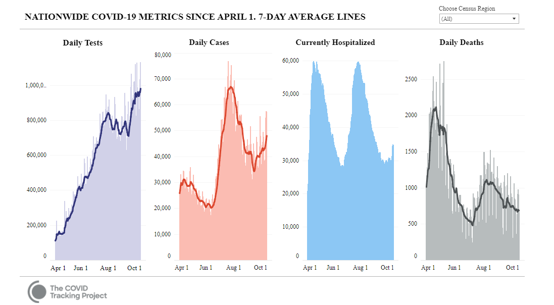
Johns Hopkins University uses this testing data for its COVID-19 Testing Insights Initiative, which brings data and expert analysis together in one place and is considered the de facto trusted source by policymakers at all levels of federal and state governments. As of Oct. 1, the charts below clearly show increases in testing, cases and hospitalizations, as well as a distinct downtrend in daily deaths.

Covidtracking.com reported their current findings for September as follows:
“Cases in the Dakotas and Wisconsin continue their troubling rise, but in September the average daily number of cases, hospitalizations and deaths fell nationwide. After a difficult summer, averaged metrics for August and September showed drops in COVID-19 cases, hospitalizations and deaths at the national level.
“At the same time, indicators in a few states are ringing alarm bells, and this week’s data continues a three-week rise in cases, with hospitalizations starting to increase as well.”
Without the benefit of last week’s data on the mortality rate, it stands to reason the market is encouraged not only by the countertrend of daily deaths versus the rising testing, cases and hospitalizations, but also the rapid recovery of President Trump after a not-yet-approved Regeneron-based antibody cocktail was administered to him.
Clearly, it’s a career killer for a doctor if a sitting president dies on their watch. So, there you go. Hence, the pull out all stops, or SWAG (“Scientific Wild Ass Guess”) approach.
But seriously, there is broad agreement that we now know much more about this virus than at any point since the outbreak. I think the market is buying into the notion that even if one or more Food and Drug Administration (FDA) approved vaccines are on the way, the real-time science of treating infected patients has rapidly advanced to where a greater number of people infected are surviving, if the charts don’t lie, and I don’t think they do.
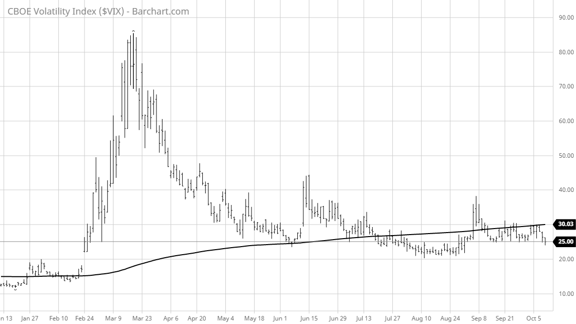
And now you’re asking, so what? Good question. Let the market data do the talking. Why is the CBOE Volatility Index (VIX) taking out the September lows when the most contentious election cycle in recent memory is three weeks out?

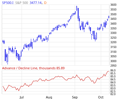
Well, big money is liking the direction in charts such as the S&P 500 Advance/Decline Line. For the uninitiated, the Advance/Decline Line (AD Line) is a breadth indicator which is calculated by taking the difference between the number of advancing and declining issues and adding the result to the previous value.
It rises when advances exceed declines and falls when declines exceed advances. It is important to compare Advance/Decline Line plotted for the index with the performance of the actual index. The AD Line should confirm an advance or a decline with similar movements. As of late September, the A/D line has turned very bullish.

Source: marketinout.com
And it’s just not the S&P seeing a positive A/D line; the Dow, Nasdaq and Russell are all showing the same uptrend. Money is flowing into stocks despite all the noise about a potential market collapse from certain outcomes following Nov. 3.
Sure, there could be some disruption from a contested election that extends for weeks before a final vote tally is obtained. But the market doesn’t seem to be nearly as concerned with this possible chain of events as it is with the earnings momentum about to be printed for the third quarter and guided for the fourth quarter.
Earnings visibility is improving. According to the data from FactSet on Oct. 9, “It does appear that some S&P 500 companies have better visibility on future earnings heading into the third-quarter reporting season than they did going into second-quarter announcements. Given that most S&P 500 companies have only one quarter remaining in their fiscal year, it would seem likely the number of S&P 500 companies issuing earnings per share (EPS) guidance for 2020 will increase again during the third-quarter earnings season.”
The table below depicts a rather sharp upturn in earnings growth going out to the second quarter of 2021. What is actually more impressive is the resumption in revenue growth, accelerating to 13.7% by Q2 2021. Companies can manufacture positive earnings, but not organic sales growth. And the market is buying into the data.

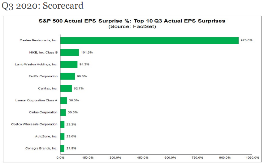
Investors already have a strong peek around the corner about how third-quarter earnings are shaping up. The companies listed below have already posted Q3 numbers.

So, maybe we should all turn down the volume on the media and pay more attention to what the charts and graphs are speaking to: it’s okay to be long in great stocks now and we’ll worry about the politics and future impact of the election process later.


